
The past few years we have worked to evolve and become the best all-in-one sustainability platform for you. Today, we share a new chapter in our journey – a refreshed look that reflects our values, our mission, and our unique identity.
Why Change?
At the core of our new brand is a celebration of what we believe in – teamwork, commitment to accessibility, and investing in our community.
Our beliefs inform everything we do–from the solutions we build, to the resources we provide, to the community and team we foster. We’re creating a future where sustainability is accessible, practiced across all businesses, positively impacting bottom lines and the environment – and we needed our brand to confidently reflect that vision.
Thank you to FinalFinal for the opportunity to work together to create something truly special.
What’s New?
Our Logo
Our new logo mark consists of a pattern of rings that bring to mind different imagery. Some things we were inspired by when updating our mark:
Fingerprints – we all know that climate change is a problem we must solve together. We also know that we are all unique and bring different strengths to our community when we come together – the whole is truly greater than the sum of its parts.
Tree Rings – as our world’s forests become more stressed, we see trees and plants become more dependent on an amazing phenomenon known as mycorrhizal networks – an interspecies relationship where plants learn to grow closely with each other and connect using complex underground interconnected root networks, ultimately creating a system of communication and cooperation.
There are several benefits to an ecosystem utilizing these networks:
- Nutrient Transfer: The network facilitates the transfer of nutrients, helping neighboring plants that may be in nutrient-deficient areas to survive and flourish.
- Disease Resistance: The network improves a plant’s resistance to disease by promoting a healthier, more robust root system.
- Stress Tolerance: Plants connected through these networks exhibit increased tolerance to environmental stressors, such as drought or nutrient scarcity.
We were inspired by the way this concept highlights the interconnected and collaborative relationships facilitated by networks like these, and how they reflect our most important values.
Our Typeface

Our new typeface is GT Flexa – a typeface that reflects our values in a number of ways. The powerful simplicity in their shapes combined with the delicate intentionality of their ink traps allows for a beautiful and adaptable grotesk font with a unique approachable personality while being legible and clear.
Our Colors

You’ll notice some bold new brand colors – particularly some revamped and energized greens and oranges. These paired with supporting neutrals make up a confident color palette that’s unique and opinionated – just like us.
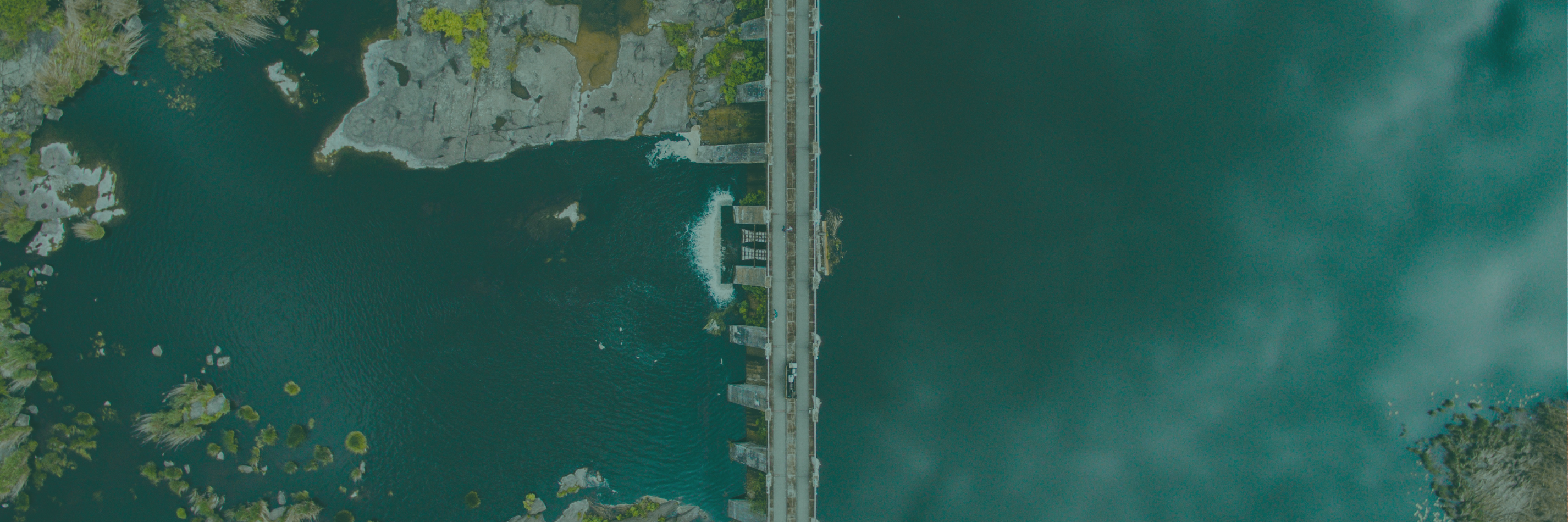
Imagery
It is important for our imagery to always feel accessible – our new photography highlights those moments where nature and humanity meet using aerial photography for a unique perspective, and our new illustrations have a hand-crafted marker texture to add a warm and approachable feeling to our Greenplaces materials – no fine lines here.

This is just the beginning.
Underneath our new refreshed look, we are still the same Greenplaces – an organization committed to democratizing sustainability and positively impacting businesses’ bottom lines and the environment.
Join us in creating and shaping the future of sustainability.


")